1) Create a new 1000x500 pixel image on a white background. Get out the text tool and type in something that you would like for your text. The font I used was size 70 black Kremlin font.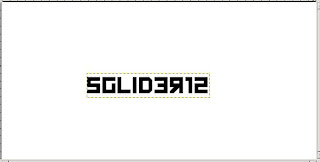
2) Create a new transparent layer and name it "outline" Drag it underneath your text layer. Right click on the text layer > Alpha to Selection. Go to Select > Grow. Grow by 3 pixels. Click Ok. Click on the Outline layer. Click the fill tool. Use color #a0a0a0 and fill the selection.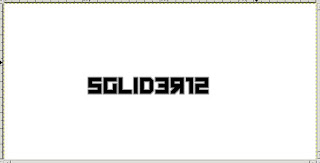
3) Merge the text layer and the outline layer. Name the layer "Text." Now, duplicate the layer. Using the move tool, move the duplicated layer 1 pixel down and 1 pixel to the left. Move the duplicated layer behind the original. Repeat this until you get something like mine: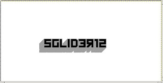
4) Create a new transparent layer named "circle." Drag the circle layer underneath the text layer. Get out the ellipse tool. Create a selection that is 185x185 pixels in size near the right above your text. Fill it with the same gray we used on the words. Select > Shrink. Shrink by 20 pixels. Click ok. Now press delete.
5) Create a new transparent layer and name it "x." Move it between the circle layer and the text layer. Get out the rectangular selection and make a selection that is 282x41 pixels. Fill it with #e06900. Rotate it and position it like in mine below. Duplicate the layer and go to Layer > Transform > Flip Horizontally. Position it again like in mine below. Merge the two x layers.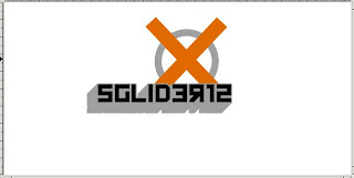
6) Click on the circle layer. Fill the inside of it with white. Now select the magic wand tool and select the inside of the circle. Select > Shrink. Shrink it by 3 pixels. Go to Select > Invert. Click on the X layer and press delete.
7) Click on the background layer. Filters > Render > Clouds > Difference Clouds.
Detail: 2
X Size: 2
Y Size: 2
Click ok.
The clouds are kinda dark, so go to Colors > Brightness/Contrast. Raise the brightness and contrast a bit, but not too much.
8) Get out the gradient tool. Make white your foreground color. From the bottom right corner, click and drag to somewhere in the middle of your text. Get to something like mine:
9) For this step you will need some super-amazing grunge and splatter brushes. Go to DeviantArt.com and search for some there. It doesn't matter if they are for Gimp or Photoshop because Gimp can read both.
Create a new layer and name it "grunge." Use your grunge brushes and splatter brushes like I did below. Remember to play around with the sizes and opacities. When you are done, merge the grunge layer and the background layer. Name it "Background."
10) Click on the background layer. Go to Colors > Colorize. Give the layer a blue hue and brighten the saturation and lightness. Get to something somewhat like mine.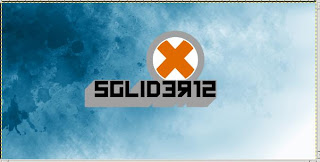
11) Duplicate the layer with your text enlarge it with the scale tool. Drag the layer to just above the background layer. Right click > Alpha to Selection. Fill it with white. Lower the opacity to 29.5. Do the same with the X layer. Position the two layers like mine and you are done. Now go play with it.
It isn't perfect, seeing as Gimp has some anti aliasing issues (believe me I tried everything to make it smoother), but hey, it was pretty damn close.
Modified by Fireworks Tutorials, Flash Tutorials, Illustrator Tutorials, GIMP Tutorials and by Photoshop Tutorials.