GIMP Tutorials

Gimp is an open-source alternative to high priced, professional graphics editing programs like Fireworks or Photoshop.


Showing posts with label abstract. Show all posts

The GIMP 1.2 series have a nice new feature I refer to as gradient brushes. Essentially, this is just the regular paint tool, but instead of painting with a constant color, it gets its color from a gradient and rotates through the gradient as you paint.

Using Gradient Brushes

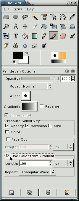
Gradient brushes can be accessed from the standard paintbrush dialog. Just check the option "Use Color from Gradient" and start painting. You can also press the Gradient button to change the current gradient. Try "German flag smooth", for instance.

Just filling in an image with a gradient brush is a good start for interesting textures, and you can make some nice ones that way.

But that gets a little boring after a while. To really spice thigns up a bit, you need some more interesting brushes. So called "grunge brushes" work quite well for this use. A very nice set can be found in the June 1999 edition of thegimp.com, in the brushes section. Get these for real fun with gradient brushes.

Basically, just select one of those brushes, and se the spacing to something reasonable (most default to 10 or so). I would suggest setting the spacing to about 80-120 or so. Of course, please experiment.

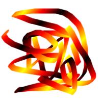
For example, lets choose the "Grunge 15" brush. Set its spacing to about 70 or so. Now choose a gradient from the the gradient selector ( Dialogs -> Gradients). Just about any of them will do fine. Pick one at random, you can get nice results from any of them. For this particular example, I used "Caribbean_Blues".

Now for the easy part. Draw random stuff on the image. Or not random. It doesnt really matter. If you want to stick to a very set pattern, your texture might look a bit more orderly. Fill the image completely if you dont want alpha poking though. Nice eh?

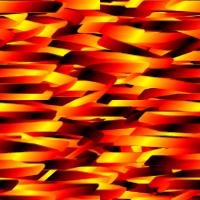
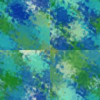
The hard part is making the image tilable. The easiest way to do this is to offset your image by half its height, and half its width. Select Layer -> Transform -> Offset. Then choose the convient "x/2, y/2" option, and hit OK. Your image will now show what used to be at its edges at the center of the image. The secret to making tileable images is to make this transition smooth.

For gradient painting with grunge brushes, this typicaly just means painting along those lines. You probabaly want to give it a bit of character so it looks more natural. You will probabaly want to avoid painting at the edges of the image when you do this. But if you do, just repeat the above steps again and you should be fine.

Offset that image one more time (or not,actually...), and your ready to go.

Things to tweak

Of course changing the gradient type, and the brush will have a big effect on the look of the texture, but so will more subtle things like the opacity of the brush, and the paint mode can make for some interesting effects. These type of textures also seem to work well for layering two or three textures together with different layer modes.

All in all, this is nice and simple, and fast way to create some colorful textures.
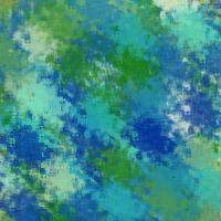
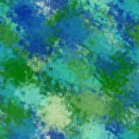
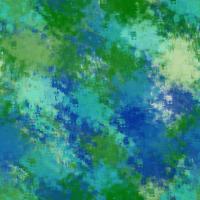
Examples

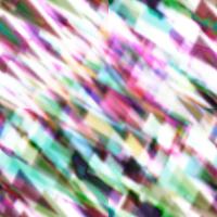
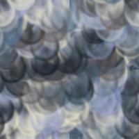
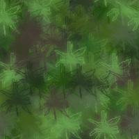
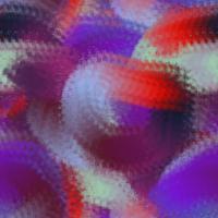
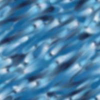
Just some examples whipped up in a few minutes.

Here's a new tutorial in Gimp for ya guys. Today I'm going to teach you how to create a fiery space explosion in Gimp based on a tutorial by Collis at PSDTuts. Here is what we are going to create:


Step 1
In the original tutorial, Collis focuses on the Rule of Thirds, a method that simply states that if you divide your canvas in three lengthwise and vertically,

your main focal points should be at the intersections, or along the lines themselves. The reason being for having your main focal point off center is that it creates a more visual interest. Take a look at this image from Collis:

Keeping that in mind, I'm going to keep my focal point in the bottom right corner.

Step 2
Alright, let's start our composition. Create a new canvas. Mine will be rather large, at 1280x800. Use a radial gradient, with a rather subtle light color where the explosion will be. Make it somewhat like mine:

Now let's give it some texture. Create a new transparent layer. Go to Filters > Render > Clouds > Solid Noise. Use these settings:

Click ok. Set the cloudy layer's blending mode to Screen and lower the opacity to about 12%.
Step 3
I chose to next use this stock due to it's texture (Right Click>Save As):
In your canvas window, go to File > Open As Layers. Open your aurora image. Rotate the image so the aurora runs lengthwise. You can also use the scale tool and adjust the aurora to better fit your image. Go to Colors > Desaturate and click Desaturate. Now get out a large, soft eraser and erase pretty much anything that isn't part of the aurora. You can leave the sky in it, though. Set the layer to Dodge and lower the opacity to 50%.

Step 4
Now we are going to add the stars. Download this image of stars below:
Go to File > Open as Layers and select the star image. Lower the opacity to about 19-20%.


Step 5
Now we'll add our planet. I am going to be using this planet found via Google:

Open up the planet as a new layer in our piece. Resize, rotate, and place it in the desired spot abiding by the Rule of Thirds I mentioned earlier.

Step 6
Now let's give our planet a little more depth. Duplicate the planet layer. Run the dodge/burn tools over it. Make the top of the planet lighter, and the bottom of it darker. Set the layer mode to Screen.

Step 7
Now let's add our planet into the image again. Do this by going to File > Open as Layers, and select your planet. Shrink the planet so it is even smaller, like in mine below. Desaturate it so it looks, well, different from our larger planet. Rotate it a bit, and use the dodge tool on the part where it will collide with the larger planet.
Step 8
Get out the gradient tool, and select FG to Transparent. Make white your foreground color. Right click > Alpha to Selection on the planet layer. Create a new layer and apply the gradient to the selection, going from where the comet is, to the bottom of the planet. Select > Deselect. Set the layer mode to Overlay and lower the opacity a bit.

Step 9
Go ahead and move the comet layer behind the planet layer. Create a new layer. Grab a large, soft brush and click only once or twice to get a nice, white, soft glow as shown.

Step 10
Now use the scale tool and the rotate tool to elongate the light like I have done. Also be sure it is tangential to the main planet.
Step 11
Now we'll add a blue glow to the outside of the light. Go to Filters > Light and Shadow > Drop Shadow. Make the X & Y Offsets 0, the radius 15, and do not allow resizing. Change the color to a darkish blue, or whatever matches your planet. Click ok.

Step 12
Duplicate the glow layer and rotate it so it's opposite the last glow layer. Go to Filter > Repeat Drop Shadow. Your second glow should have the same glow as the first. Let's add some color to it now. Get out another large, soft brush. Now I want to stick with a sort of blue explosion. I'll make my brush blue. Paint the explosion a bit and set the layer mode to Overlay. Duplicate the layer. Set the new layer to Screen.

Step 13
Duplicate one of the light layers. Go to Filters > Blur > Motion Blur. Use these settings:

Set the layer mode to Screen, and lower the opacity.


Step 14
Now we want to create a tail behind our comet. Duplicate your layer we just made. Lower the opacity. Smush it a little and blur it a bit. Place it behind our comet. Give it some color if ya want. Remember to change opacities and such and to also play around a bit with what you're making. Makes it more, creative, I guess you could say.


Step 15
Now we are going to grab this image found via Google:

We will use this image to form some of the tail lights on the comet. Open this image as a layer and place it behind our two planets. Use a soft eraser and erase everything except for what you see in the image below. It makes it look somewhat like particles are being thrown out by the collision. You can even duplicate the layers a couple times and make it different.

Step 16
Right click on the planet layer and select Alpha to Selection. Create a new layer behind the planet layer named "backglow." Fill the selection with white. Select > Deselect. Press the Up & Left arrow keys a few times to move the white ellipse in the direction shown. Afterward, go to Filters > Blur > Gaussian Blur. Blur by 40. Click ok. Set the backglow layer to Overlay and duplicate it. Blur it again, and move it up and to the left even more.

Step 17
Now we need the all-important lens flare. Create a new layer above all the others and fill it with black. Go to Filters > Light and Shadow > Lense Flare. Render your lense flare. Set the layer mode to Screen.

Step 18
Now we'll apply a subtle blur to soften the whole image. Go to Edit > Copy Visible and Paste as Layer. You should now have a new layer with our WIP on it. Duplicate it. Hide one of them. Desaturate the visible one. Go to Filters > Blur > Motion Blur. Select Zoom as the type of blur. Play around with it until you get something like this:

Step 19
Now set the blurred layer to Overlay at 20% opacity. Alright now grab the other layer we hid earlier. Repeat the blurring process to it (but don't desaturate it!). Set it to 10% opacity.

Step 20
Let's add some texture to it, shall we? Alright, so grab one of these paper textures from BittBox. Open the texture as a layer like we have done previously. Move the layer to in between the light layers. Erase all but the parts where I haven't.

Set the layer to Overlay. Lower the opacity if needed.

Step 21
Alright we are almost there! Yay! Now let's add in this image of the moon via Google:

Open it as a layer in our composition. Shrink the size of it down to about the size of our comet. Get out the burn tool and burn the side of the moon facing away from the explosion.

Step 22
Now let's make our moon interact with the explosion a bit more. Use the eyedropper tool and select one of the main colors from the explosion. That turns out to be a blue for me. Right click on the moon layer, and select Alpha to Selection. Create a new layer. Use a soft brush to paint a cresent shape with our selected color. Be sure it is facing the explosion. Duplicate the cresent layer. Blur it with Gaussian Blur by 8 or so.

Now you are done! Enjoy.

Let's be honest. I like Apple, I really do, but what keeps me from buying Apple products is the fact that it's just too expensive, and nothing is upgradeable. I do like the looks of Apple products, though, except the iPod. I prefer my Zune. But doesn't that iPhone look slick? (It's expensive, too.) But anyway, let's design us one of those fancy iPhones in Gimp. Remember, you can click the images to make them bigger. Also remember to save often, since Gimp has a tendency to crash.


Step 1
Let's create a new document in Gimp, preferably no less than 1024x768 big. Make the background black. Create a new layer and name it "inner black." Get out the Rectangle Select Tool, and make a selection about like mine. Afterward, go to Select > Rounded Rectangle, and enter about 30 for the radius. Click ok. Change the foreground color to black, and the background color to #323333. Apply the gradient from bottom to top.


Step 2
Now we want to create the outer silver part that outlines the iPhone. Create a new layer and name it "outer lining." With your previous selection still active, go to Select > Grow. Grow by 15. Click ok. Select the gradient tool. Make the foreground color a light gray and the background color white. Apply the gradient tool from bottom to top. Create a new layer and name it "outer-inner lining." Select > Shrink. Shrink by 7. Apply the gradient tool from top to bottom.

Select the paintbrush tool. Select the Circle (01) brush. Make white the foreground color. Go to Edit > Stoke Selection. Select the paintbrush radio button. Click ok. Select > Deselect. I also took the blur tool around the white stroke a bit to smooth out the line. Merge the two outline layers.


Step 3
Get out the rectangle select tool to make the screen. Create a new layer and name it "screen." Fill the selection with #447AB0.


Now personally, I don't feel like making the screen completely from scratch. I guess I'm just too lazy to do it. I'm going to use this picture of an iPhone and steal it's screen. You can copy if you wish, or make your own.


Step 4
Now for the speaker. Create a new layer and name it "speaker." get out the Rectangle Select Tool and select an area about what I have selected. Select > Rounded Rectangle. Use 80 as the radius. Use black as the foreground color and white as the background color. Fill it from top to bottom like I have. Select > Shrink. Shrink by 3 pixels. Fill the selection with black.

Step 5
Now for the camera. Create a new layer and name it "camera." Get out the Ellipse Select Tool and select an area about what I have. Fill it with white. Select > Shrink. Shrink by 1 pixel. Fill the selection with a black and white gradient from top to bottom.

With your selection still active, click the paths tab above the layers dialog. Click on the Selection to Path button. You should have a new path pop up in the paths dialog. Select > Deselect. Grab the paths tool. Click and drag the new path into the work area. You should now have a path where your selection was. Use the path tool to adjust the path to about what I have done:


After you have your path ready, click the Selection from Path button in the toolbox. Fill the new selection with black. Select > Deselect. Get out the Rectangle Select Tool and make a selection like I have. Select > Rounded Rectangle. Use 30 for the radius. Fill the selection with a very light gray. Select > Shrink. Shrink by 1 pixel. Fill with black. Select > Deselect. Now we're done with the iPhone part of the tutorial. Happy? Good. :D

Step 6
Now let's create the rest of the advertisement. (This half of the tutorial is based on a tutorial by Fabio at PSDTuts.) Create a new layer above the background layer. Fill it with a radial, white to black gradient. Get out the Rectangle Selection Tool and select a rectangle that covers about the bottom half of the screen. Fill it with a very dark red on a new layer.


Step 7
Create a new layer. Select a blue color (#113e4b) for the foreground color and black for the background color. Go to Filter > Render > Clouds > Solid Noise. You should now have clouds in your previous selection. Go to Colors > Colorize. Slide the Hue bar until you get a dark blue like I have. Lower the Lightness a little bit.
Step 8
Select the Perspective tool and distort the floor as I have below. Click Transform when done.


Add some blur to it by going to Filters > Blur > Gaussian Blue. Put 8 in box boxes and click ok. Lower the opacity to make it a bit darker.


Step 9
Repeat the steps 7-8 to create another set of clouds, but this time, use a dark pink hue instead of blue. Note: If you duplicate the blue layer, it won't work because we need to use different clouds.

Step 10
Create a new layer just like you did in step 6. Select black and white for your foreground and background colors. Get out the radial gradient tool and apply it, with white in the center. Change the blend mode to Dodge. Note: I've hidden my iPhone layer so you can see what mine looks like.
Step 11
Create a new layer. Get out the Lasso Tool. Create a selection like I have below. Then go to Select > Feather. Feather by 100px.
Go to Filters > Render > Clouds > Solid Noise. Let's add more blur to the clouds. Filter > Blue > Gaussian Blur. Put 35 in both boxes and click ok. Set the blend mode to Dodge. Delete the part of the cloud that is not on the floor.
Step 12
Now we'll create the background's light. Create a new layer. Use the Rectangle Select Tool and select the top part of the background (from the top of the floor, up). Go to Filters > Render > Clouds > Solid Noise. Click ok. Go to Colors > Brightness/Contrast. Lower the brightness and raise the contrast some.
Create a new layer and fill the existing selection with #84a7b8. Set the blending mode to Overlay.
Create another layer and get out the gradient tool. Create a new gradient with the colors #fba46f, #cb8cd4, and #346777. Fill the existing selection with that gradient. Set the blending mode to Overlay. I also took the eraser tool to the cloud layer we just made and erased some of the parts.
Step 13
Create a new layer. Get out the lasso tool. Make a selection like I have. Feather by 100 like before.
Filter > Render > Clouds > Solid Noise. Select > Deselect. Get out the blur tool and blur parts of the image. Set the blending mode to Dodge.
Step 14
Reveal your iPhone that we hid earlier. Let's add some lights in front of our iPhone. To do that, create a new layer.Choose a soft brush and and use about a 50% opacity. First choose an orange color, and brush a little bit up in the top left corner. Then, choose a pink color and paint around the left side of the phone. Change the blend mode of the layer to Overlay. You can also add another layer of clouds, but erase most of them, leaving behind a few gray parts.
Step 15
For the most part, we are completely done with it. Yeah, it does look a bit plain, with just the iPhone on top. I decided to use the Outer Glow filter from FX-Foundry Scripts (which you can download here) and added a few other glows.

Subscribe to: Posts (Atom)